

How to Choose Colours for Modern Home Decor Success
on Dec 24, 2025
Most urban millennials are surprised to learn that nearly 60 percent of british home makeovers are influenced by natural light dynamics. With minimalist and eco-friendly aesthetics gaining popularity, understanding your space and its lighting is essential for choosing colours for modern home decor success that truly transform your home. This guide unveils expert steps for selecting hues that highlight your personality, match modern british trends, and create environments both stylish and sustainable.
Quick Summary
| Key Point | Explanation |
|---|---|
| 1. Assess lighting for colour selection | Understand how natural light influences colour appearance to make informed decisions on your palette. |
| 2. Define your personal style | Create a mood board to identify styles and colours that resonate with your aesthetic and emotional preferences. |
| 3. Explore current colour trends | Research contemporary palettes to find inspiration that reflects your personal taste and enhances your space. |
| 4. Test colour combinations in space | Gather sample colours and observe how they look in various lighting conditions to ensure harmony with your home’s features. |
| 5. Adjust colours based on experience | Be open to refining your colour choices based on how they interact with your mood and existing decor over time. |
Step 1: Assess Your Space and Lighting
Successfully choosing colours for modern home decor starts with carefully understanding your unique space and how light transforms its aesthetic. This initial assessment provides the critical foundation for selecting colours that will harmonise beautifully with your home’s architectural characteristics.
Begin by examining your room’s physical dimensions and natural light sources. Contemporary interior design emphasises open spaces and strategic natural lighting which dramatically influence colour perception. Stand in the centre of your room and observe how sunlight moves throughout the day. Note which walls receive direct morning or afternoon light, as this will significantly impact how colours appear. Rooms with northern exposure tend to have cooler, bluer light that can make colours appear more muted, while southern facing spaces offer warmer, more vibrant illumination that can intensify colour tones.
Measure your room’s dimensions and map out the primary light sources windows, overhead fixtures, and potential accent lighting. Understanding these spatial dynamics helps you predict how different colour selections will interact with your specific environment. Sketch a quick floor plan noting light entry points, architectural features like alcoves or archways, and existing furniture placement. This visual mapping provides a strategic overview that prevents colour selection becoming a guessing game.
Top Professional Advice: Take multiple photographs of your space at different times of day to capture how natural and artificial lighting transforms the room’s ambience, providing a comprehensive reference for your colour selection journey.
Here is a summary of how different lighting types affect colour perception in home decor:
| Lighting Type | Effect on Colour Appearance | Ideal Colour Choices |
|---|---|---|
| Northern Exposure | Cooler light, muted appearance | Warm neutrals, soft pastels |
| Southern Exposure | Warm light, intensified tones | Bold hues, deep accent tones |
| West/East Exposure | Variable light during the day | Mid-tones, versatile shades |
| Artificial Lighting | Depends on bulb (warm/cool) | Test both warm and cool swatches |
Step 2: Define Your Style and Mood
Identifying your personal home decor style is more than selecting attractive colours it is about creating an environment that authentically reflects your personality and emotional landscape. This crucial step transforms your living space from a mere room into a meaningful personal sanctuary.
Home decor styles range from Modern and Traditional to Transitional, each offering unique visual languages that communicate different emotional experiences. Modern styles typically embrace minimalism with clean lines and neutral colour palettes, suggesting calm and sophisticated energy. Traditional styles often incorporate warmer tones and intricate details, conveying comfort and timeless elegance. Consider which emotional response you want your space to evoke warmth, serenity, creativity, or perhaps dynamic energy.
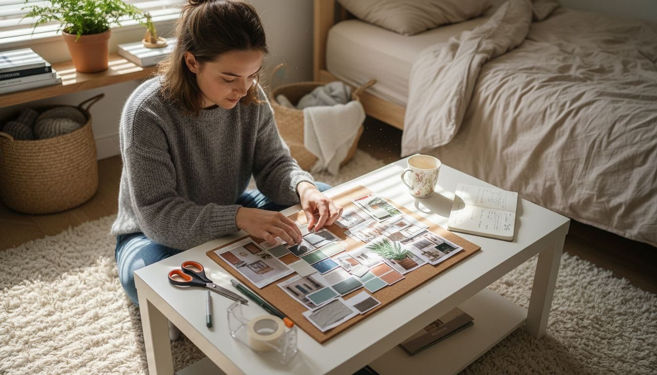
To truly define your style, create a mood board that captures your aesthetic preferences. Collect images from design magazines, Pinterest, or interior design websites that resonate with you. Look beyond individual items and observe the overall feeling these spaces generate. Pay attention to colour schemes, textures, furniture silhouettes, and architectural elements that consistently appear in images you are drawn towards. This visual exploration will help you understand your subconscious design preferences and emotional connections to different aesthetic approaches.
Top Professional Advice: Experiment with digital design tools or apps that allow you to visualise different colour and style combinations before making final commitments, helping you avoid costly design mistakes and ensuring your chosen aesthetic truly represents your personal vision.
The following table compares common interior design styles by colour tendencies and emotional impact:
| Style | Typical Colour Palette | Emotional Atmosphere |
|---|---|---|
| Modern | Neutral, monochromatic, minimal | Calm, sophisticated, spacious |
| Traditional | Warm tones, rich hues | Comfort, timeless, elegant |
| Transitional | Mix of neutrals and accents | Balanced, inviting, dynamic |
| Contemporary | Neutral base, bold accents | Trendy, energetic, dramatic |
Step 3: Explore Colour Inspirations and Trends
Unearthing the perfect colour palette for your home requires more than random selection it demands strategic exploration of contemporary design trends and personal aesthetic preferences. This step will guide you through discovering inspiration that transforms your living space into a personalised visual narrative.
Contemporary interior design trends showcase a fascinating blend of neutral foundations with bold accent colours, offering exciting possibilities for creative expression. Emerging colour palettes are moving beyond traditional boundaries increasingly embracing rich deep tones like navy blue, emerald green, and burgundy that add dramatic sophistication to living spaces. These colours work brilliantly when strategically integrated allowing you to create visual depth and emotional resonance within your home environment.
To effectively explore colour inspirations, develop a multi-source research approach. Browse design magazines, follow interior design influencers on social media, visit local home decor exhibitions, and collect colour swatches from paint suppliers. Create a digital or physical mood board that captures colours and combinations that genuinely excite you. Pay attention to how different shades interact with lighting, furniture, and architectural elements. Look beyond current trends and focus on colour combinations that spark joy and reflect your unique personality.
Top Professional Advice: Take photographs of spaces you find inspiring and use digital editing tools to experiment with colour overlay techniques, helping you visualise potential colour schemes in your own environment before making final design commitments.
Step 4: Select a Harmonious Colour Palette
Selecting a harmonious colour palette is an art form that transforms your living space from merely functional to genuinely inspiring. This critical step bridges your personal style with design principles that create visual coherence and emotional resonance.
Different interior design styles offer distinct approaches to colour selection, each with unique strategies for creating visual harmony. Begin by understanding the fundamental colour wheel principles exploring relationships between primary, secondary, and tertiary colours. Consider using complementary colours opposite each other on the wheel for dynamic contrast or analogous colours sitting adjacent to one another for subtle sophisticated blending. A classic approach involves selecting one dominant colour and two to three supporting shades that create depth and visual interest without overwhelming the space.
To achieve true palette harmony, develop a systematic selection method. Start with a foundational neutral tone that provides a calm backdrop perhaps a soft grey, warm taupe, or gentle ivory. Then introduce accent colours that reflect your personality and desired emotional atmosphere. Consider the psychological impact of each colour warm tones like terracotta and mustard can create cosiness while cool blues and greens promote tranquillity. Balance is key experiment with the 60-30-10 rule where 60 percent of your space features a dominant colour 30 percent features a secondary colour and 10 percent provides vibrant accent elements.
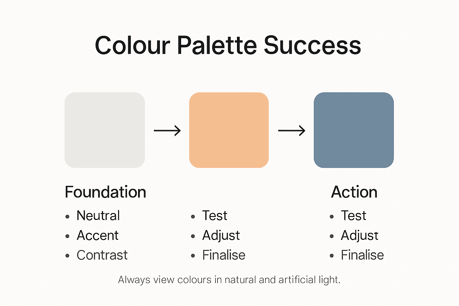
Top Professional Advice: Create physical colour swatches using paint samples and observe them in different lighting conditions throughout the day to understand how natural and artificial light transforms their appearance and emotional impact.
Step 5: Test and Adjust Your Colour Choices
The journey of selecting the perfect colour palette culminates in a critical phase of testing and refinement where theory transforms into tangible design reality. This step ensures your carefully chosen colours genuinely work together in your actual living environment.
Creating a comprehensive mood board serves as an essential visual testing strategy for evaluating colour interactions and overall aesthetic harmony. Begin by gathering large paint swatches or sample boards representing your chosen colours and arrange them in your actual space. Observe how these colours interact under different lighting conditions natural daylight, evening lamp light, and artificial overhead illumination can dramatically alter colour perception. Pay close attention to how colours complement or clash with existing furniture, flooring, and architectural elements. Document these observations by taking photographs from multiple angles to help you analyse the colour dynamics objectively.
Develop a systematic approach to colour testing that goes beyond visual assessment. Consider the emotional and psychological impact of your colour choices in different times and moods. Spend time in the space during various hours noting how colours make you feel energised, calm, or inspired. Be prepared to make subtle adjustments experiment with lighter or darker shades introduce complementary accent colours or modify your original palette based on these lived experiences. Remember that colour selection is an iterative process requiring patience and willingness to refine your initial vision.
Top Professional Advice: Use removable paint samples or large adhesive colour sheets that can be easily repositioned allowing you to experiment with different colour placements without committing to permanent painting.
Transform Your Colour Vision into Home Reality
Choosing the perfect colour scheme for modern home décor can feel overwhelming when faced with the challenge of harmonising style, lighting, and mood. This article highlights key pain points such as understanding natural and artificial lighting effects, defining your personal style, and creating a balanced colour palette that truly reflects your personality. By recognising how every shade interacts within your space, you are empowered to build an environment that is not only beautiful but emotionally uplifting.
Bring your carefully selected colours to life by exploring a diverse range of home goods and lighting solutions at Stomart. Our collection supports your journey from inspiration to execution with products designed to complement any modern aesthetic or lighting condition. Do not wait to create the sanctuary you deserve. Start experimenting with colours and finishes today and discover how simple it is to elevate your living space at Stomart.co.uk. Your perfect palette awaits.
Frequently Asked Questions
How do I assess the lighting in my space for colour selection?
Start by observing how natural light moves through your room at different times of the day. Take note of which walls receive direct sunlight and how this affects colour appearance, helping you choose hues that harmonise with the light in your space.
What steps should I take to define my personal style for home decor?
To define your personal style, create a mood board by collecting images that resonate with you. This visual representation will highlight consistent themes and colours in your preferences, guiding your design choices.
How can I explore current colour trends for modern home decor?
Research contemporary design trends by browsing design magazines or following social media influencers in the interior design space. Collect colour swatches that excite you and reflect your unique tastes to create a personalised colour palette.
What is an effective way to create a harmonious colour palette?
Select a foundational neutral colour as your base and then introduce two to three accent colours. Use the 60-30-10 rule, dedicating 60% of your space to the main colour, 30% to a secondary colour, and 10% to accents for a balanced look.
How do I test colours before making final decisions?
Gather large paint swatches of your chosen colours and arrange them in your space under different lighting conditions. Spend time in the room observing how the colours interact and adjust as needed based on how they make you feel.
What should I do if my chosen colours clash with my existing decor?
If your chosen colours clash, consider making subtle adjustments by experimenting with lighter or darker shades or introducing complementary accent colours. This iterative process may involve several tweaks, so give yourself time to refine your colour choices.